Sapori Bruzi
Identity and site for Sapori Bruzi: pizzeria, restaurant and deli in Calabria. Authentic tradition, “just like home”, with pizza as a superpower to spread happiness.
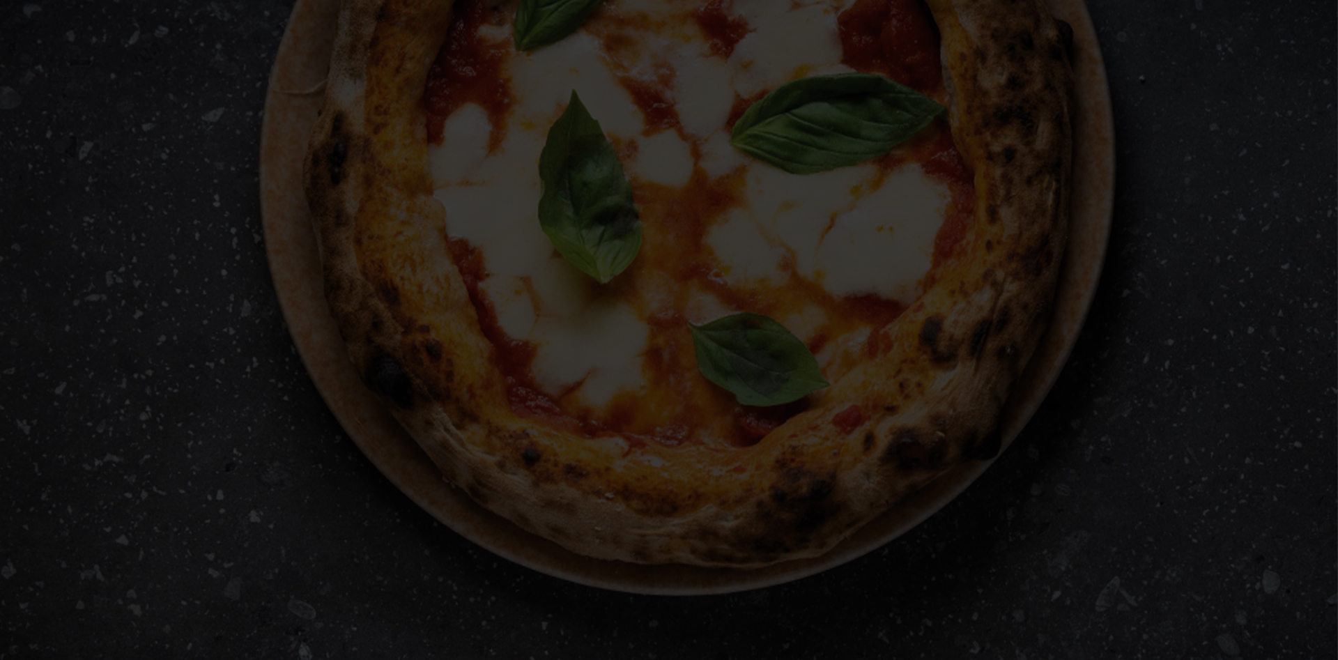
Three souls — pizzeria, restaurant, deli — one brand.
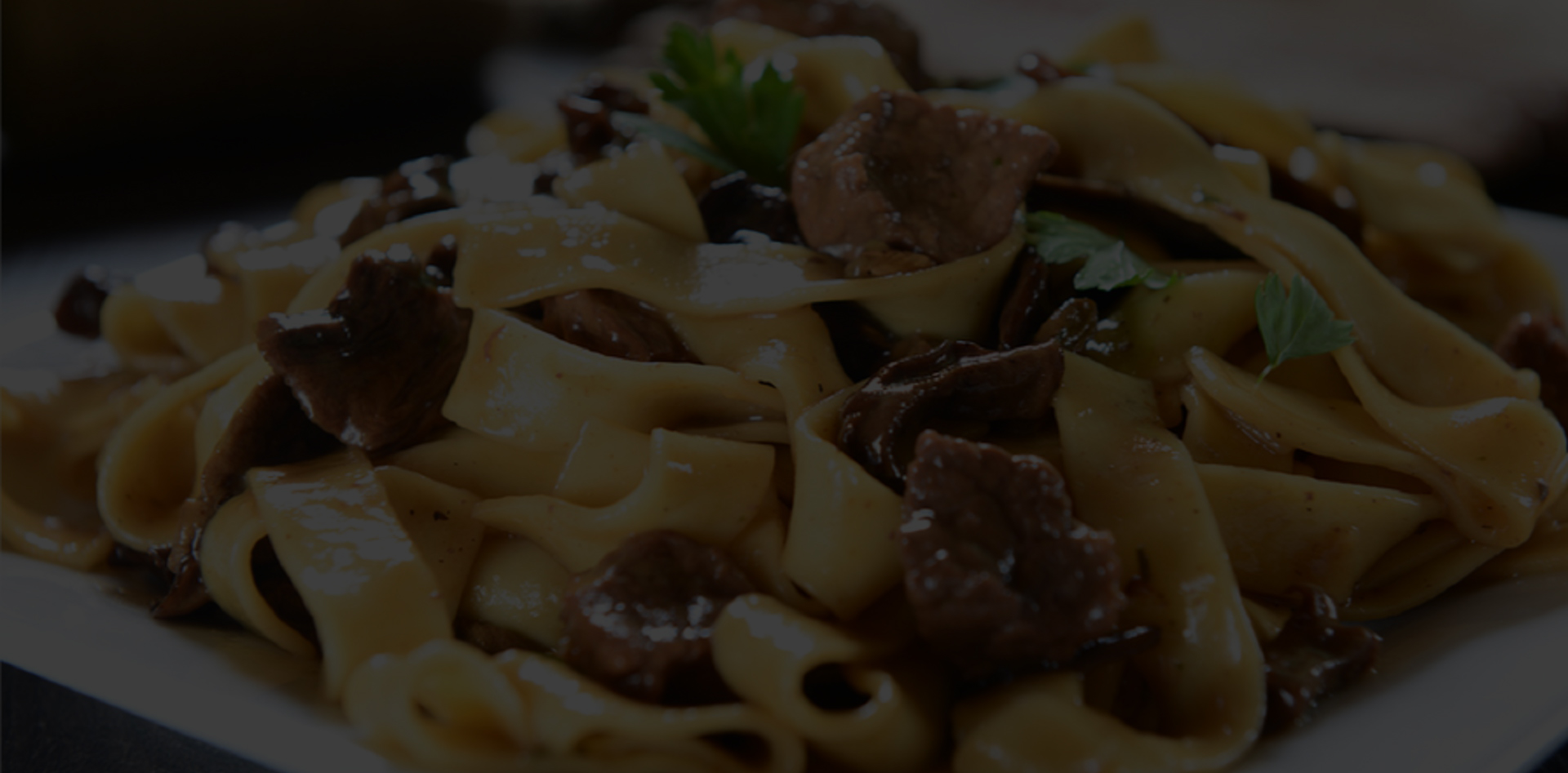
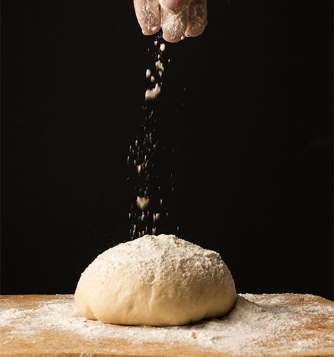
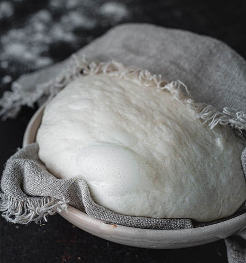
Sapori Bruzi is pizzeria, restaurant and deli in one. It needed a warm, genuine identity, “just like home”, able to hold the three souls together and make you hungry straight from the site, between naturally-leavened doughs and local ingredients.
Tradition, warmth, real ingredients.
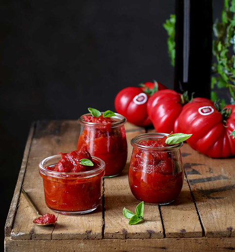

A warm, genuine mark.
The logotype plays on bold, rounded lettering, as welcoming as the sign of a neighbourhood trattoria. It works on the menu, takeaway boxes and signage, holding pizzeria, restaurant and deli together.
Rounded, friendly, appetite-whetting.
A geometric, warm sans for headings and menu: clear on prices, inviting on dishes, from screen to pizza box.
From the menu to the takeaway boxes.
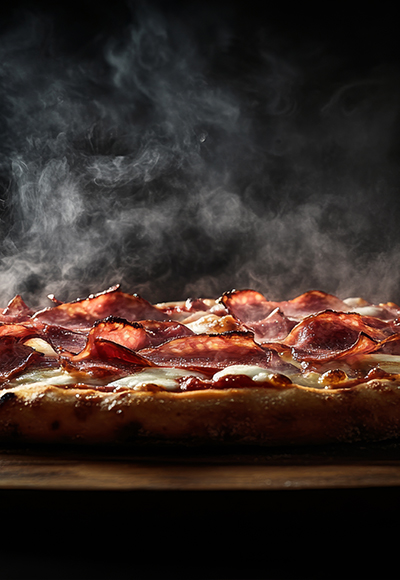
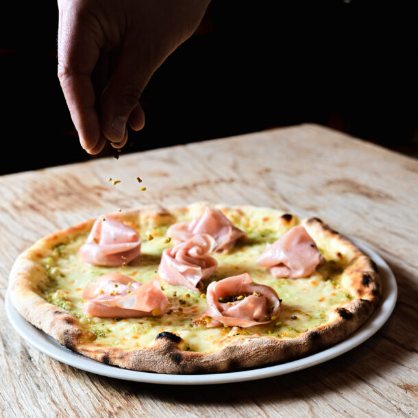
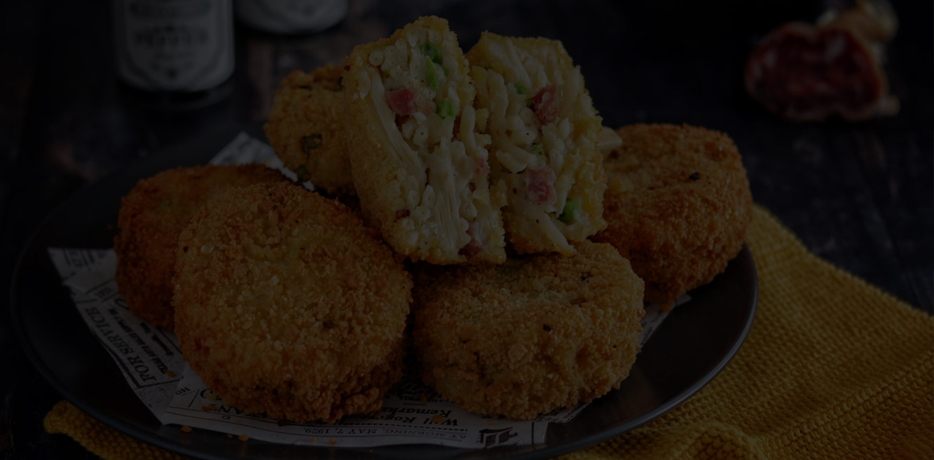
A brand that makes you hungry, in person and online.
“The new site looks like us: people book and order just by looking at the photos.” — Sapori Bruzi